Pet Health Mobile App
Redesigning Vetster’s pet care telehealth experience so care is accessible anywhere.
Pet Health Mobile App
Redesigning Vetster’s pet care telehealth experience so care is accessible anywhere.
Category:
Mobile App Design
Project Role:
Lead Designer
Year:
2024
Company:
Vetster

What is Vetster?
Vetster is a pet telehealth platform that connects pet parents with licensed veterinarians and veterinary technicians through on demand or scheduled video consultations, enabling remote guidance, diagnoses, and prescriptions when appropriate to make veterinary care more accessible and convenient.

Problem
Vetster’s previous mobile app reflected outdated branding and was limited to basic features such as appointment booking, video consultations, and prescriptions. It also suffered from user experience issues including confusing information architecture and inconsistent use of visual elements.
Goal
The revamp aimed to modernize branding and visual consistency while building a strong foundation for feature expansion, transforming the mobile app into a centralized pet care hub and reducing reliance on the outdated web app.
Result after 1st year of revamp
0%
0%
Search-to-book conversion (compared to web 6.4 %)
4.0⭑
4.0⭑
US iOS rating (from 3.5⭑)
4.0⭑
4.0⭑
CA iOS rating (from 4.1⭑)
Result after 1st year of revamp
0%
0%
Search-to-book conversion (compared to web 6.4 %)
4.0⭑
4.0⭑
US iOS rating (from 3.5⭑)
4.0⭑
4.0⭑
CA iOS rating (from 4.1⭑)
$0k
$0k
eCommerce additional revenue from upgraded experience
↑0%
↑0%
In mobile app booking
↑0%
↑0%
Subscription conversion
$0k
$0k
eCommerce additional revenue from upgraded experience
↑0%
↑0%
In mobile app booking
↑0%
↑0%
Subscription conversion
Before & After
Comparing the user interface of the previous and redesigned mobile app
Before & After
Comparing the user interface of the previous and redesigned mobile app
Before & After
Comparing the user interface of the previous and redesigned mobile app
Process
The revamp followed a phased, iterative approach, allowing us to move from concept to MVP in approximately four months. It was a complex yet fast paced process.
Flow chart
Captured and documented core mobile app workflows to prioritize design efforts and ensure edge cases were thoughtfully addressed.
Major feature upgrades
Major feature upgrades
Major feature upgrades
Appointment booking experience
Study how we improved the booking experience, achieving a 13 % conversion rate compared to 6.5% on the web.
Painpoints
The previous booking flow across both web and the early mobile app was a multi step experience that required pet parents to navigate several separate screens. Users had to add or select their pet, choose a location and concern, then select a veterinarian and time slot before reaching checkout. This lengthy process introduced significant friction and frequently became a blocker, contributing to drop off throughout the booking journey.
Solution
The revamped booking experience reorders the flow by introducing the veterinarian first, with the closest available time slots surfaced immediately as primary options. Pet and location are automatically preselected based on the user profile and can be changed if needed, but when correct, two steps are effectively removed from the flow. While pet and location influence which veterinarians are shown, they are relatively stable over time and rarely require frequent changes. Concerns can also be selected directly on the vet selection screen, providing early context without affecting which veterinarians are surfaced. Along the happy path, users only need to select a time slot to proceed directly to checkout. Pet selection remains editable at checkout if changes are needed, and required details such as concern and reason for visit are captured within the same step to reduce context switching. During checkout, users can choose to continue with a single pay per appointment option or subscribe to Vetster Plus, which offers higher ongoing value and supports long term care needs.
Pre & Post-appointment
We wanted to ensure pet parents clearly understand what to expect from the moment they book an appointment through the end of the visit.
Painpoints
One of the major pain points identified through user conversations was the lack of guidance throughout the pre and post appointment experience in the previous app. Pet parents often did not know what to expect or how to prepare for their appointments, which led to uncertainty and reduced confidence in the experience.
Solution
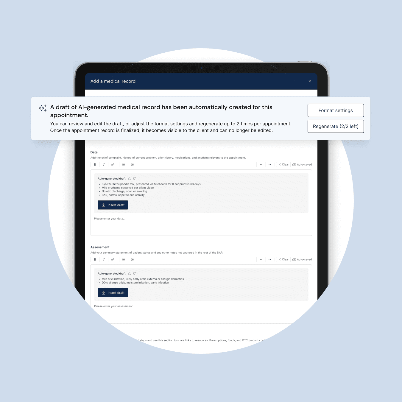
In the new mobile app experience, we not only guide users to provide additional information that may be helpful for veterinarians, but also set clear expectations around how to join their appointment. After the appointment, we dynamically surface next steps and actions based on the user’s current stage, clearly communicating where they are in the process. While waiting for the veterinarian to finalize the medical record, users can explore helpful information such as how prescriptions work or leave a review for their appointment. Once the medical record is finalized, users are notified and guided to review it, view any prescribed medications, and seamlessly complete their prescription fulfillment.
Painpoints
One of the major pain points identified through user conversations was the lack of guidance throughout the pre and post appointment experience in the previous app. Pet parents often did not know what to expect or how to prepare for their appointments, which led to uncertainty and reduced confidence in the experience.
Solution
In the new mobile app experience, we not only guide users to provide additional information that may be helpful for veterinarians, but also set clear expectations around how to join their appointment. After the appointment, we dynamically surface next steps and actions based on the user’s current stage, clearly communicating where they are in the process. While waiting for the veterinarian to finalize the medical record, users can explore helpful information such as how prescriptions work or leave a review for their appointment. Once the medical record is finalized, users are notified and guided to review it, view any prescribed medications, and seamlessly complete their prescription fulfillment.
Prescription fulfillment
Making prescription fulfillment easy and flexible for pet parents.
Painpoints
At the time we explored this feature for the new mobile app, both the previous app and web experience supported only a single prescription fulfillment option, ordering through the online pharmacy in the United States, while Canadian pet parents were left without clear direction. If pet parents wanted to send their prescription to a different pharmacy, they had to contact RVTs through support chat or ask the veterinarian to handle it. This created unnecessary friction and shifted administrative work onto veterinarians, responsibilities that would not typically fall within their role in a traditional clinic setting.
Solution
With these gaps in mind, our goal was to automate prescription fulfillment within the mobile app while avoiding the shift of additional administrative work to veterinarians. Once a prescription is issued during an appointment, it is automatically added to the pet parent’s shopping cart. Within the appointment experience, pet parents are clearly guided to choose between ordering the prescription directly through the app or sending it to an external pharmacy. If pet parents already know where the prescription should be sent, they can simply provide a few required details. If not, they are guided to connect with RVTs directly within the app to resolve the request quickly. This approach reduces friction for pet parents while keeping prescription logistics out of the veterinarian’s workflow. Ordering through the app is intentionally effortless, since prescriptions are prefilled in the cart with the correct quantity and options based on the veterinarian’s instructions, allowing pet parents to proceed straight to checkout. Both fulfillment methods provide clear tracking and status updates within the order or request details screen, addressing a major gap in the previous experience where prescription progress lacked visibility.
Design System
While building components and applying the updated branding for this mobile app project, I also had the opportunity to establish a design system from scratch, which previously did not exist at Vetster. This screenshot shows part of a living, evolving component library, with the full system documented in greater detail elsewhere.

End-to-end product flow
As the project was broken into multiple initiatives, I built and maintained a document that captured the end to end flow. This screenshot shows a living, evolving reference that brings together different flows and variants. The design team will regularly revisited and updated it so the broader team could easily view and stay aligned on the full experience.

(TORONTO BASED /
18:29
)
Product Designer
(TORONTO BASED /
18:29
)
Product Designer
(TORONTO BASED /
18:29
)
Product Designer
More Work
More Work
More Work