[01] Context
WHAT_IS_VETSTER
Vetster is a pet telehealth platform that connects pet parents with licensed veterinarians and veterinary technicians through on demand or scheduled video consultations, enabling remote guidance, diagnoses, and prescriptions when appropriate to make veterinary care more accessible and convenient.
Vetster's mobile app was the front door for pet parents, but the core journey had become fragmented as the product evolved. This revamp focused on creating a cohesive, end-to-end care experience across booking, visits, and prescription follow-through.
[02] Problem
Vetster is a pet telehealth platform connecting pet parents with licensed veterinarians and technicians through on-demand or scheduled video consultations, providing remote guidance, diagnoses, and prescriptions when appropriate.
NO_DESIGN_SYSTEM
The app still carried old branding with no shared design system, so the customer experience felt inconsistent screen to screen.
IA_NOT_SCALABLE
Information architecture had not kept up as features grew, so pet parents could not find what they needed easily.
FEATURE_PARITY
Mobile only covered basic booking and video. Pet parents had to return to web to fulfill prescriptions, and could not sign up or manage prescriptions in the app.
GOAL
Modernize branding and visual consistency, build a foundation for feature expansion, and transform the app into a centralized pet care hub, reducing reliance on web.
[03] Solutions
Four high-impact flows, booking, pre and post-appointment guidance, prescription fulfillment, and subscription sign-up and management, captured in a living end-to-end flow document the team revisited as initiatives shipped.
BEFORE_vs_AFTER
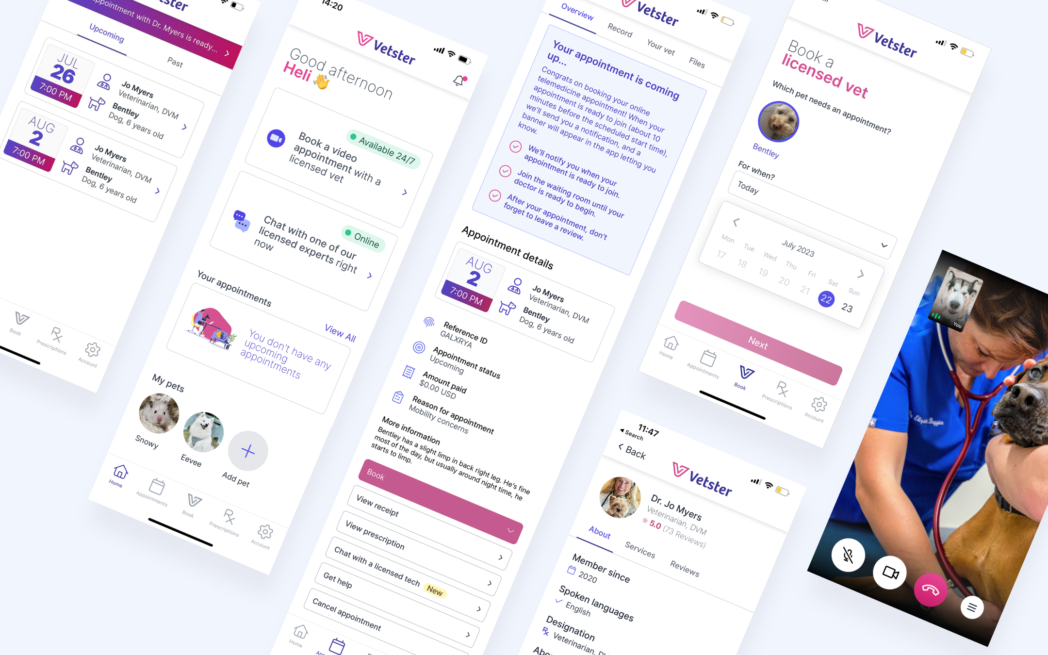
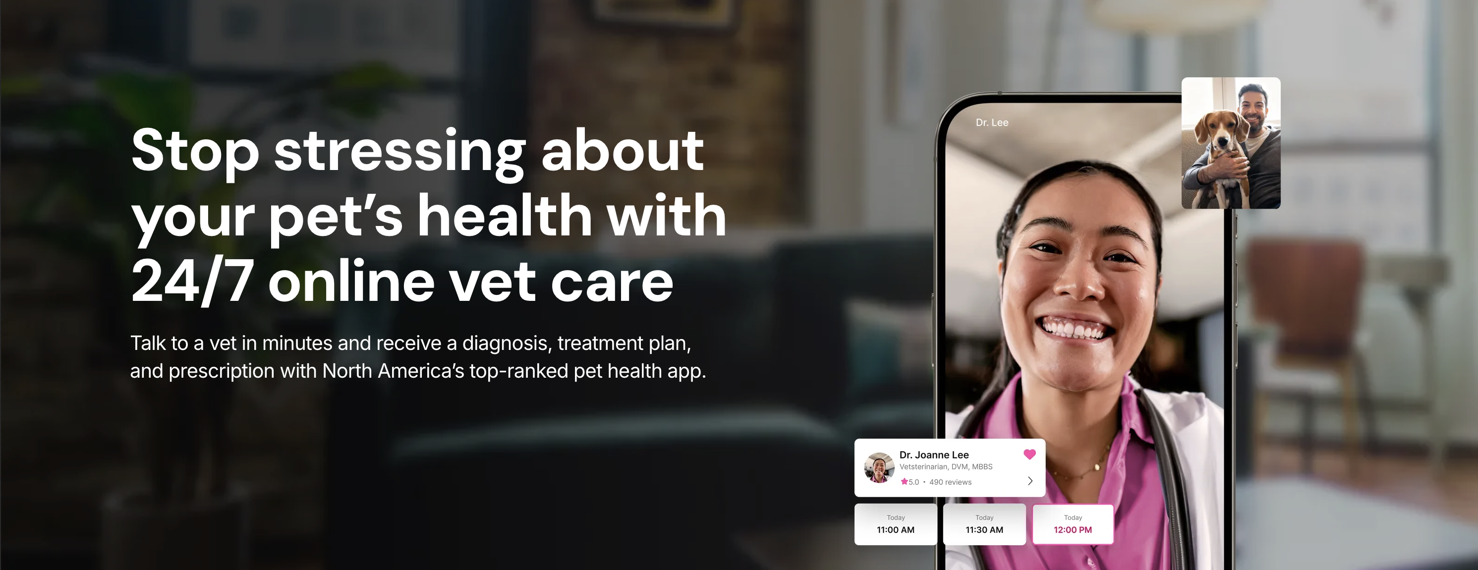
Appointment booking
Pain: Multi-step flow across separate screens, pet, location, concern, vet, time, and checkout, created friction and drop-off.
Solution: Lead with the veterinarian and surface closest available slots immediately. Pet and location preselect from profile; concerns on the vet screen. On the happy path, pick a time → checkout. Mobile search-to-book reached 13% vs 6.5% on web on the same funnel.
Pre & post-appointment
Pain: Pet parents didn’t know what to expect or how to prepare, and that uncertainty reduced confidence before and after visits.
Solution: Clear prep and join guidance, plus dynamic next steps after the visit based on stage, such as waiting for medical record, reviewing Rx, leaving feedback, or exploring how prescriptions work. Mobile booking share rose to 35% (from 23%) and session share to 35% (from 28%).
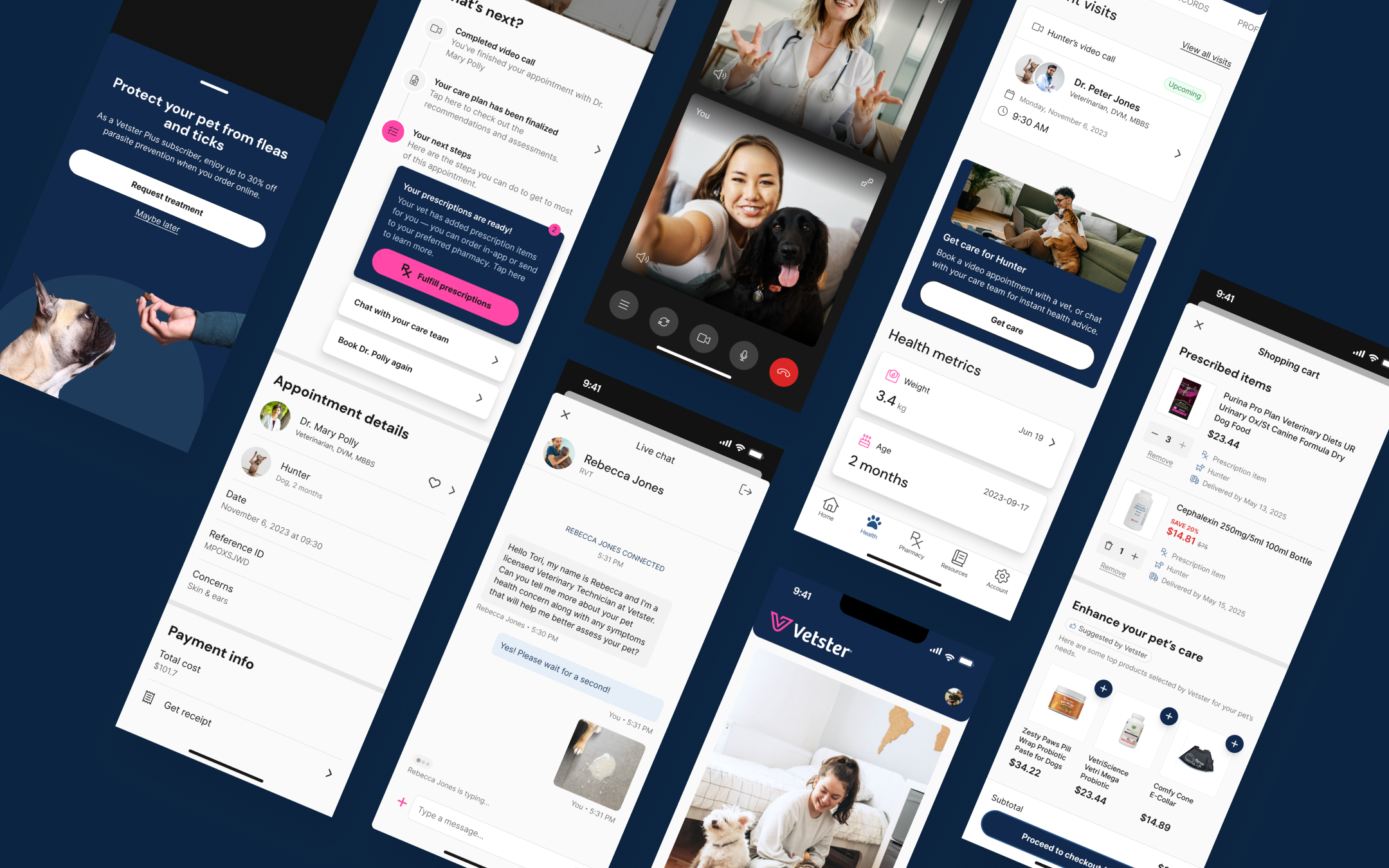
Prescription fulfillment
Pain: There was no in-app prescription fulfillment process in the previous mobile app, so the customer experience felt broken and users had to bounce back and forth to web. There was also no implemented flow for users who wanted to send prescriptions to outside pharmacies.
Solution: Auto-add Rx to cart; choose in-app order vs external pharmacy with minimal details or RVT chat for help. In-app checkout prefilled from vet instructions; both paths get clear status tracking. Ecommerce additions contributed 162K in additional revenue after launch.
Subscription sign-up & management
Pain: Pet parents could not subscribe or manage plans in the app, so recurring care stayed on web and mobile missed a core retention and revenue surface.
Solution: Built in-app subscription sign-up, plan selection, and account management so members could start, change, and manage care plans without leaving mobile. Active subscriptions grew 4×, ARR reached 1.32M (from 560K), and conversion on eligible journeys hit 31% (from 15%).
Design system
Established Vetster’s first design system from scratch while building components for the revamp, a living library that evolved with each release.
The screenshot shows only a partial snapshot of foundational tokens; the full system also covers principles, usage guidelines, property rules, and extends into component specs.

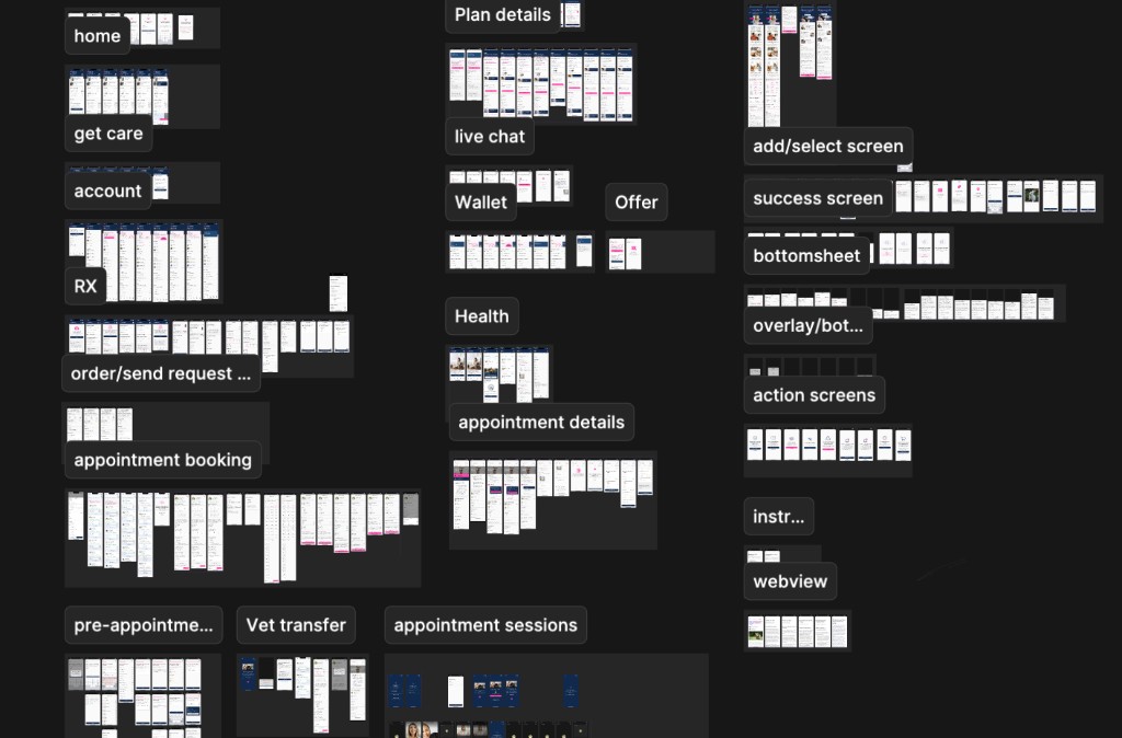
End-to-end flow map
Maintained a cross-initiative document of flows and variants so product, design, and eng stayed aligned on the full experience as scope grew.
The screenshot shows only a partial snapshot of MVP screens and user-journey mapping; the full map also sequences steps, documents variants, and extends as new initiatives shipped.
[04] Process
Phased and iterative, from concept to MVP in roughly four months. Existing mobile users accelerated research; competitive analysis and new art direction ran in parallel.
[05] Outcomes
App store ratings sit above the fold as overall product proof. Use the initiative tabs below to focus on booking, engagement, ecommerce, or subscription metrics from the first year after launch.
INITIATIVES
Appointment booking flow — search-to-book on mobile vs web after the streamlined vet-first path.
Pre & post-appointment guidance — mobile share of bookings and sessions after clearer prep and visit follow-through.
Prescription fulfillment — in-app checkout and pharmacy paths tied to commerce revenue.
In-app subscription sign-up & management — recurring care plans and conversion on eligible journeys.