[01] Context
HKIF is a non-profit holistic innovation ecosystem tied to the Ng Family. The mission, empowering today’s innovators to transform Hong Kong into the technology hub of tomorrow, anchored discovery and the site’s narrative arc.
PROGRAMME_PILLARS
HKIF’s work is organised around four programme pillars, Initiatives, Sponsorship, Innovations, and Scholarship, each describing how the foundation seeds talent, backs partners, accelerates solutions, and widens STEAM access. Hover or focus each pillar (reduced motion: details still appear on focus).
[02] Problem
In halls, classrooms, and partner conversations, HKIF already felt like a serious innovation institution. Online, that same intent dissolved: the experience felt like a default non-profit template. Typography, colour, imagery, and page structure did not add up to a single recognisable HKIF, so first-time visitors could not quickly answer who HKIF is, why it exists, or why they should care.
GOAL
The goal of the redesign was not only to refresh visuals, but to shape HKIF’s mission and message for the web, so the same narrative could speak, in parallel, to the general public, sponsors and partners, and innovators and students, each with different questions, through one coherent brand.
[03] Solutions
The site had to make HKIF’s pillar structure legible: visitors should see one ecosystem with clear lanes of impact, not a loose page tree. Visual language, layout, and interaction carried that story from homepage through programme and contact surfaces.
GENERAL_PUBLIC
Make the mission plain in plain language, who HKIF serves, what “innovation ecosystem” means in practice, and how families and communities benefit, without burying humanity under jargon.
SPONSORS_AND_PARTNERS
Signal institutional seriousness: pillars, programmes, and geography of work visible at a glance, so backers see a governed organisation worth aligning with, not a loose collection of pages.
INNOVATORS_AND_STUDENTS
Show that HKIF is a living hub for ideas, and that STEAM access, initiatives, and Sino Inno Lab read as invitations to participate, not footnotes at the bottom of a brochure.
LOOK_AND_FEEL
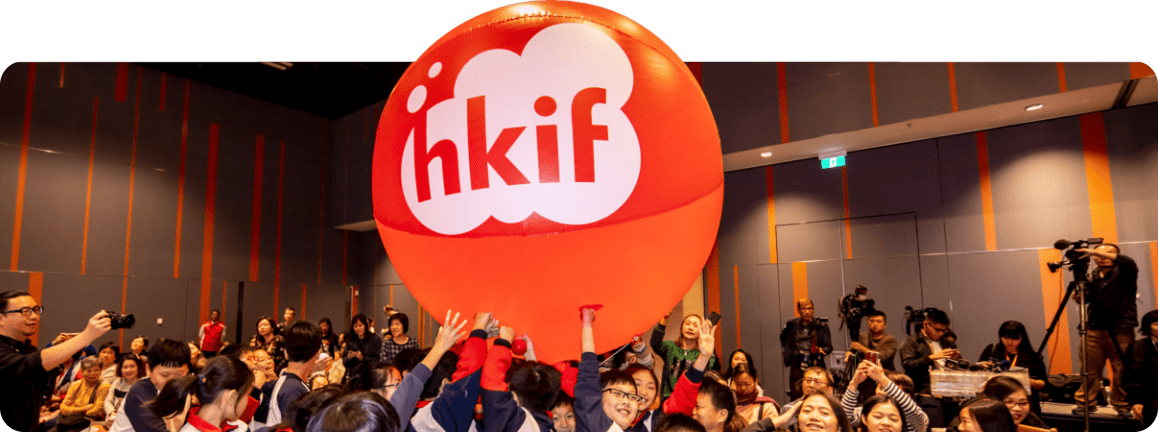
Simple dots and lines form icons for HKIF’s technology focus areas; in motion, they connect into an ecosystem, with HKIF as the medium linking innovation with people in Hong Kong. Below: a collage of shipped surfaces and a homepage recording with navigation from the 2020 launch.
SHIPPED_SURFACES
A visual snapshot of the shipped HKIF system, combining foundation, scope, news, and contact surfaces into one cohesive story.
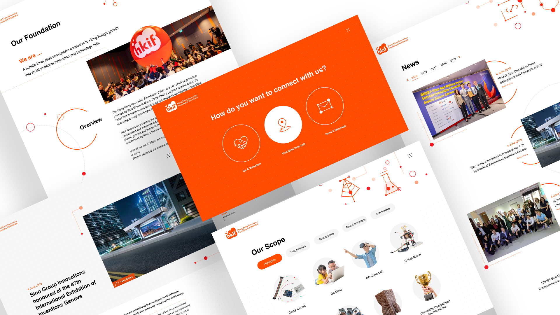
HOMEPAGE_WITH_MENU
Full homepage with expanded navigation, captured from the shipped experience.
[04] Process
Discovery through launch, keeping HKIF’s mission as the north star while pressure-testing layouts with real programme content.
-
01 / 04
Discovery
Research, field visits to the innovation hub, and client interviews, mapping vision, values, and HKIF’s role in the ecosystem.
-
02 / 04
Design
Multiple visual directions explored so the site could authentically represent HKIF as a bridge between technology and community.
-
03 / 04
Art direction
Circular forms, high-contrast colour, and kinetic typography, with unified rules for layouts, iconography, and photography.
-
04 / 04
Development
Partnered with engineering to ship motion and interaction details without diluting the concept.